What design taught me about code
A good amount of frontend developers I've met came from CS degrees or self-taught programmers. Myself, I came from design and marketing.
My formal education was in branding, marketing, and multimedia design. Development happened later not because I planned it, but because I had ideas I wanted to build and nobody else was going to build them for me. So I learned.
For years I thought this background was a gap, something I had to overcome or compensate for. I was surrounded by people who understood algorithms and data structures, and I was the guy who used to push pixels in Photoshop and draw nice looking things in Illustrator.
It took me a while to realize: that wasn't a weakness. It was an edge.

The language gap
There's one thing that I've seen that delays projects more often than bad code: terminology. People using the same words to mean different things.
Take "header".
To a business person, it's the top of the page with the logo.
To a designer, it might be the hero section, the masthead, the navigation area.
To a frontend developer, it's the <header> element — or maybe an HTTP header, or a table header.
To a backend developer, it's definitely the HTTP header, and they're confused why anyone would call anything else that.
Same word. Four different mental models. And in meetings, everyone nods along like they're aligned when they're not.
I've seen this play out dozens of times. One project had a naming war that dragged on for weeks. The design team was naming components by color: blue button, green button, red alert, orange warning. Then variations started creeping in; light yellow, dark yellow, "level 2 yellow," whatever that meant.
Then the CTA button changed from green to blue.
Suddenly the "green button" was blue, and the whole naming system collapsed. What should have been a simple color update became a mess of find-and-replace and confused developers asking which blue we meant.
The fix was semantic naming. Not "green" but "positive", not "red" but "danger", not "blue button" but "primary action". Names that describe what something is, not how it currently looks.
This seems obvious in hindsight. But getting a design team to shift from visual naming to semantic naming is a conversation. Sometimes a long one. And if you don't speak both languages; if you can't explain why this matters in terms designers understand it doesn't happen.
The mental model gap
Designers with print backgrounds think in pixels. They want pixel-perfection. They measure everything in fixed units and expect it to render exactly as designed.
The web doesn't work that way.
I spent over two months on one project trying to align a design team with how screens actually work, how DPI varies, how a 16px font on one screen is not the same as 16px on another. Users zoom. Users have accessibility needs. Users have crappy old monitors and users have 5K retinas, and you're serving all of them with the same code.
Relative units lie em, rem exist for a reason. Flexible layouts exist for a reason. The reason is that the web is not print.
The hardest conversation was about the viewport meta tag. Someone had added user-scalable=no to prevent zooming. Clean, right? The design always looks as intended.
Except: that's an accessibility disaster. People with visual impairments need to zoom. You've just completely broken your site for them.
I had to convince seven people to remove that line of code. Seven. For one line. Because the argument wasn't technical it was about letting go of control. Accepting that the design would look different on different devices. That "pixel-perfect" is a fantasy on the web.
These conversations are hard. Not because the concepts are hard, because people don't like being told they're missing something. There's ego involved. Defensiveness. Designers who've been doing this for years don't love hearing that their mental model doesn't fit the medium.
I've lost my patience in these discussions. More than once, but I've also learned what works.
Sometimes the technical argument lands, sometimes it doesn't. Other times what works better is the emotional case: "Here's a user who can't read your site because they can't zoom in. Here's someone with low vision who needs high contrast. Here's what happens when your fixed layout breaks on their device."
Real people, real consequences. That gets through when principles don't. If that doesn't, then it's all politics and then good luck to you cause that's another beast to tame.
Where it shows up
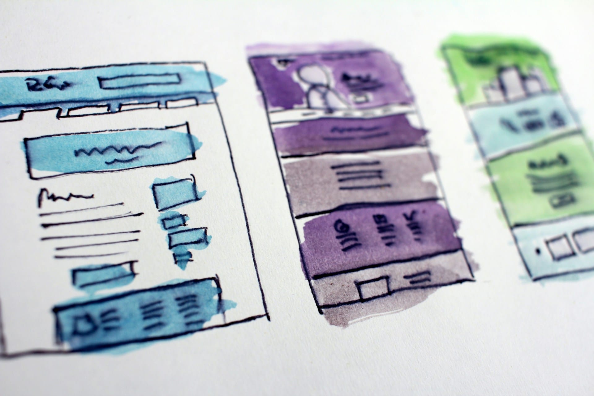
The place my design background shows up most clearly is in building design systems and component libraries.
I've built a few of these from scratch. And every time, I do something that frustrates designers at first: I strip the aesthetics.
Early iterations have no shadows or wrong shadows, muted colors, imperfect spacing. Because I'm not building the visuals first; I'm building the structure.
Font families, line heights, a spacing scale that actually makes sense (sm, md, lg, xl, 2xl — consistent across everything), defined border styles, action states, props and their limitations, data formatting standards.
This is the foundation. Get it wrong, and you'll be retrofitting forever. Get it right, and adding polish later is easy.
Most developers I've worked with want to build the button that looks like the mock-up. That's usually the wrong first step.
The right first step is: what is a button in this system? What states does it have? What sizes? What variants? How does it compose with other elements? Where are the boundaries? What happens in another language, let's say German when the same word might have 34 characters? What about mandarin? Do we care about internationalization?
You answer those questions with structure, not colors.
Designers sometimes hate this phase, it's cumbersome, annoying and repetitive question arise and you end up with more unanswered questions than answers.
It feels slow. It feels like the work isn't progressing because it doesn't look like progress.
But when you uncover and unravel all that mystery ball and you know what you know, and you know what you don't know and you can live with the unknowns until a later time, respond to all the burning priority questions, then the system is solid, you can change the primary color in one place and watch it propagate everywhere correctly. You can add a new variant in minutes. You can hand it to another developer and they understand how it works.
That's what structure buys you. And I think I see it more clearly because I came from the visual side. I know what designers want. I also know what will break if you build for the mock-up instead of the system.
The bridge
The value of my design background isn't that I can make things look good. Plenty of developers can do that.
The value is that I can translate between two worlds that often talk past each other.
I understand what designers mean when they say something "feels off" and I can turn that into a specific CSS fix. I understand what developers mean when they say something is "too complex" and I can explain it to designers in terms of maintenance burden and edge cases.
More than that: I can navigate the people part. The egos, the resistance, the long roads to alignment that should be short, the moments where logic doesn't work and you need a different approach.
That's the actual skill. Not "design + code." Translation. Mediation. Getting people to the same page when they didn't even realize they were reading different books.
The gap, and the close
You know, I used to feel less legitimate around CS purists. The ones who cared more about algorithmic elegance than whether the thing actually worked for users. The more academically inclined ones that care more about a line by line text-book recitation rather than the underlying concept understanding. They usually tend to be the ones that fight for days or even weeks about tabs vs spaces.
Well, I don't feel that way for a long time.
Results matter more than credentials.
Shipping matters more than purity.
Understanding people: designers, developers, users matters more than understanding Big O notation.
I came from a design and marketing background. It actually taught me how to see structure before aesthetics. It taught me how to translate between worlds. It taught me that the hardest problems usually aren't technical.
That's not a gap. That's an edge.
#thoughts
If you're reading this and you're someone thinking about changing fields — maybe you're a designer considering code, or an accountant eyeing tech, or something else entirely here's what I'd tell you:
Your previous experience isn't baggage. It's a lens.
You'll see problems differently than your new peers. That's not a weakness to overcome, it's an advantage to lean into. The designer who learns to code sees things the CS grad doesn't. The teacher who becomes a developer understands communication in ways the self-taught coder might miss. The accountant turned engineer has an intuition for systems and edge cases.
Learn from your colleagues. Get leveled up. Understand the domain deeply. You'll probably be wrong a lot at the beginning that's fine. Everyone is, even later in life.
But given enough time, the pieces start connecting. The click happens. And when it does, you'll realize you're not playing catch-up anymore. You're bringing something to the table that nobody else in the room has.
That's not a gap you need to close. That's an edge you get to keep.
Subscribe to get the latest updates
Member discussion